

PART 2: Mean Reversion in the Data
What markets have repeatedly shown and how they have behaved after periods of extreme performance.
At a Glance
- Mean reversion appears across public and private asset classes, not just equities.
- Large gaps between strong five-year periods and what follows are common.
- Periods of weak performance have often been followed by stronger recoveries.
- Assets perceived as stable or defensive are not immune to mean reversion.
- Understanding how different asset classes behave after extremes provides useful context for portfolio construction.
Concepts like mean reversion are easy to accept in theory and harder to appreciate in practice. The impact tends to become clear only after leadership has shifted, and expectations have adjusted. Looking at long-term data helps bridge that gap. By examining what has historically followed periods of unusually strong or unusually weak performance, patterns begin to emerge that are difficult to ignore.
In this section, we examine eight asset classes across public and private markets and compare their strongest and weakest five-year periods to the results that followed.
Looking at the Data
In our analysis, we examined eight asset classes and indices: the S&P 500, S&P/TSX, Cambridge Private Credit, Cambridge Real Estate, Cambridge Infrastructure, Cambridge Private Equity, the Markit iBoxx Liquid High Yield Index, and the Bloomberg Aggregate U.S. Bond Index.
For each, we identified the best-performing five-year periods over the past 90 years (where data was available) and selected the top five of those periods. We then compared those results with the five-year period that immediately followed each peak.
We also examined mean reversion by looking at periods when these asset classes performed poorly over five-year stretches and then comparing those results with the five-year period that immediately followed.
Let’s examine each data set separately, starting with the S&P 500.
U.S. Equities: S&P 500
S&P 500 Ann. Return (1926 - 2025): 10.49%


What can we observe from these results?
- The average five-year peak returns are almost 19% per year higher than the returns in the five years that follow. In two cases, the gap is closer to 30% per year.
- The mean total return (average) for the S&P 500 was 10.49% from 1926 to 2025.
- Over the last five years, the S&P 500 total return to January 6 was 13.5%, or about 3% above the long-term average. That is not excessive. However, when we look at the last three years, the S&P 500 total return has been 23.6% annually, roughly in line with the high-performance group.
This raises the question of whether U.S. stocks can extend the bull market for another two years. As a note of caution, consider the graph below showing the Shiller CAPE index, which measures the S&P 500’s 10-year trailing P/E ratio. Valuations are near record levels and roughly one-third higher than they were in 1929.
Shiller PE Ratio


Source: Robert J. Shiller, Irrational Exuberance (Cyclically Adjusted P/E Ratio for the S&P 500), via multpl.com.
If this bull market continues, our equity strategy will underperform as we become more defensive, focusing on dividend cash flow rather than the Magnificent Seven.
We will not be alone. The chart below shows the equal-weighted S&P 500 total return over the past three years. By reducing the influence of technology stocks and AI-driven names, it provides a useful contrast. Over this period, the index has still delivered a very respectable 12.1% annually, but that is roughly 10% per year less than the S&P 500 total return index.
Let’s hope that when the S&P 500 does revert, it does so without being “unkind, cruel, or malicious,” as was the case in Mean Girls.
S&P 500 Equal Weight Total Return (^SPXEWTR)
USD | Jan 14, 20:00


Source: YCharts, S&P 500 Equal Weight Total Return Index (SPXEWTR).
Canadian Equities: S&P/TSX Composite Total Return
S&P/TSX Composite Ann. Return (1956 - 2025) 9.43%


Results for the TSX are currently less extreme with respect to valuation than they are for the S&P 500, but they are still quite elevated.
- The gap between the best five-year performance and the ensuing five years is more than 20% annually.
- The long-term return for the S&P/TSX Composite total return has been just over 9% per year since 1960.
- However, over the last five years, returns have been approximately 18% annually or roughly double their historical average.
- This has reduced the dividend yield on the index to just under 2.5% annually.
More than a year ago, we decided to focus on dividend growth stocks for the Canadian market. As a result, our Canadian Equity Fund now has a current yield of approximately 3.75%, or about 50% higher than the index. That shift has reduced total returns to an average of 12.8% over the last five years, but with a significantly lower level of volatility.
It is equally important to note that the average of the five worst-performing periods for the S&P/TSX is close to zero, followed by average returns of more than 16% per year.
Private Markets: Smoother in Practice, but Not Immune
Cambridge Private Credit
Cambridge Associates has been advising major institutions with respect to asset mix since 1973. They maintain indices for private credit, real estate, and infrastructure. We begin with private credit.
In the case of fixed income asset classes, we would expect a smaller gap between over- and under-performing periods of time. Nevertheless, the change is still quite notable, exceeding 10% per year, even though changes in actual interest rates over these periods were more modest. Private credit is more impacted by the direction of interest rates, with rising rates presenting challenges, and by recessionary environments when default rates rise.
Average annualized return from Apr 1986 to Mar 2024: 9.83%
Average return for most recent 5yrs (Apr 2019 to Mar 2024): 8.54%


One interesting point to note about private credit is that, over long cycles, it has delivered returns comparable to equity markets with much lower volatility. Liquidity for private credit has limitations, but they are notably less restrictive than what investors experience in private equity or real estate.
Impact of Closed-End vs. Open-End Funds on Liquidity
Most private asset funds, whether credit, equity, or infrastructure, are closed-end. This means an investor commits a certain amount of capital to a particular asset class. For example, assume a commitment of $1 million. That capital is invested by the asset manager (the general partner) over a period that typically spans three to five years. The investment then remains in a limited partnership until the individual assets within the partnership are sold.
The full process often takes 10 to 15 years before an investor receives both their capital and returns.
Returns are often higher than in public markets, particularly in private credit, and in cases such as infrastructure there are few public alternatives available.
Returns to investors are measured based on when capital is invested, not when it is committed. This has a tendency to exaggerate returns when compared with open-ended evergreen vehicles, where all capital is invested at one time. For a more detailed explanation of these two structures, see the appendix below. In some comparisons, a return of 9% per year in an open-ended fund can deliver the same dollar outcome as a 14% per year return in a closed-end fund.
This makes comparisons difficult. For context, the five-year annualized return of the Nicola Private Debt Fund (open-ended evergreen pool) was 8.7% as of November 30, 2025.
Cambridge Real Estate
The table below shows absolute returns for commercial real estate in North America over the past several decades. Most investors are aware of how poorly both commercial and residential real estate markets have performed over the last three years. Historically, the total return for income-producing real estate has closely matched stock market returns, including dividends.
Since 2022, those relationships have been turned on their head. The question is whether we are likely to see mean reversion between these two asset classes.
Real Estate Ann. Return (Q1 1986 - Q1 2024) 7.78%


The table shows the extreme shift in returns between the five years leading up to the Global Financial Crisis and the five years that followed. The gap was almost 30% annually.
How do things look today? There are two charts below. The first shows the MSCI Private Commercial Real Estate Index for Canadian institutional investors such as us.


Note that returns since 2022 have been negative for the index but positive for Nicola Canadian Real Estate LP, with a spread of 3.2% per year. Over a five-year period, returns improve to 4.2% and 7.4%, respectively. Both the index and our Canadian real estate funds are private. REITs represent the public version of real estate investing, and both their long- and short-term results have been disappointing.
The chart below shows the five-year total return for the S&P/TSX Capped REIT Index. On a cumulative basis, the index delivered approximately 28% (about 5% annualized), compared with more than 40% cumulative (about 7% annualized) for the Nicola Canadian Real Estate LP. The chart also highlights the level of volatility experienced by the index.
S&P/TSX Capped REIT


Source: S&P Dow Jones Indices, S&P/TSX Capped REIT Index Total Return, via S&P Global.
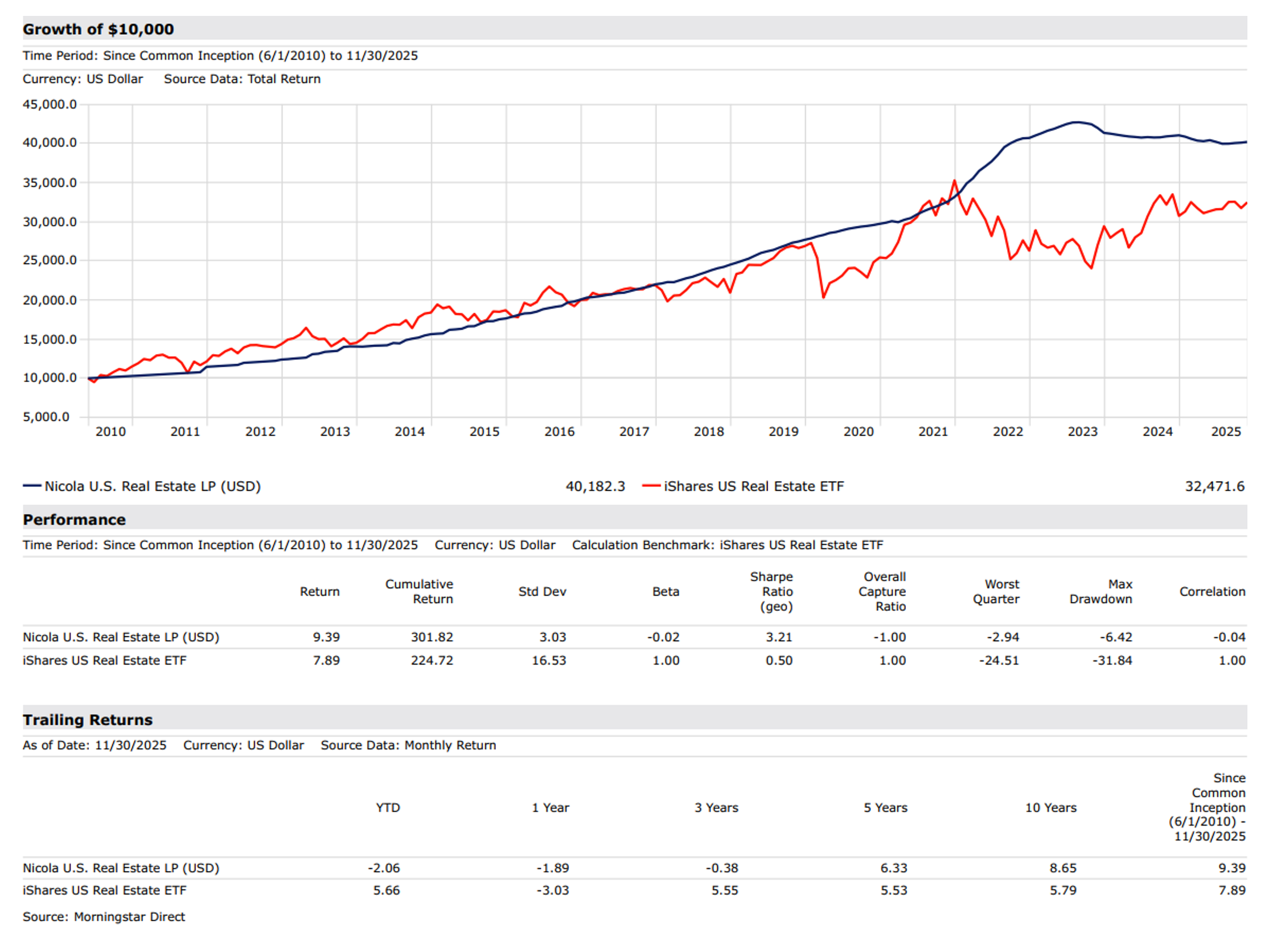
Looking over the longer term in both the U.S. and Canada, and comparing our private approach to real estate investing, it is clear why we view privately owned real estate, run by strong management teams, as the better model based on both return and risk.
Nicola Canadian Real Estate LP vs. iShares S&P/TSX Capped REIT ETF


Nicola U.S. Real Estate LP (USD) vs. iShares U.S. Real Estate ETF

Cambridge Private Equity
Private equity returns are represented using the Cambridge Private Equity Index, a commonly used institutional benchmark.
Private equity has delivered strong long-term returns, but results have been cyclical. Periods of very strong performance have often been followed by more moderate outcomes, while weaker periods have tended to be followed by meaningful recoveries.
The table below highlights a clear pattern of mean reversion. The best five rolling five-year periods generated average annual returns of 23.6% but were followed by much lower returns, averaging only 9.6%. By comparison, the weakest five-year periods generated average returns of 6.7%, yet were followed by strong rebounds averaging 16.9% per year over the next five years.
Private Equity Ann. Return (Q4 1983 - Q1 2025) 13.38%


Cambridge Infrastructure
Infrastructure has been available to major institutions for many years. It tends to provide strong cash flows that are often inflation-protected, but it also requires long commitments of capital, as assets such as toll roads, hospitals, bridges, and tunnels have lifespans measured in decades. Infrastructure also benefits from tax-favoured cash flow and a low risk of default, given that tenants are often governments or government-related entities.
Notwithstanding these characteristics, infrastructure can still mean revert. In the five years leading up to the Global Financial Crisis, returns averaged more than 17% annually. In the five years that followed, returns dropped to approximately 2% per year. In most cases, cash flows would have remained relatively stable. The impact came from pricing.
Infrastructure Ann. Return (Oct 1994 - Mar 2024) 5.0%
Infrastructure Ann. Return recent 5-year (Apr 2019 - Mar 2024) 10.2%
Infrastructure Ann. Return recent 5-year (Apr 2015 - Mar 2024) 10.1%


Bonds: Even the “safe haven” Mean-Reverts
Bloomberg U.S. Aggregate Bond Total Return
Bonds are supposed to be the safe haven in a 60/40 portfolio of stocks and bonds, but there are many instances where mean reversion reveals its more brutish and ugly nature.
The table below shows the impact of the sharp decline in interest rates after Paul Volcker pushed them to more than 20% by 1981. That rise and subsequent fall in rates ultimately succeeded in bringing inflation under control, but at the cost of mortgage rates reaching as high as 24% for those unlucky enough to be on the wrong maturity date.
It was a home run for investors in long bonds, who earned almost 20% per year over the following five years. While the next five years still delivered reasonable results, with average total returns of about 9%, returns declined by roughly 10% per year from the prior period. That bond bull market continued until COVID drove 10-year yields down to 0.5% in early 2022.
Bloomberg US Aggregate Bond Ann. Return 1976-2025: 6.52%


A similar pattern of mean reversion shows up in high-yield credit markets, as seen in the Markit iBoxx Liquid High Yield Index. The strongest five-year periods for high-yield bonds averaged just over 10% per year but were followed by much lower returns averaging about 5.7%.
By contrast, the weakest five-year periods produced average returns of only 1.5% yet were followed by strong recoveries averaging more than 7% per year over the next five years.
Even in higher-yield segments of the bond market, periods of strong performance tend to set the stage for more muted returns, while periods of stress often create the conditions for stronger recoveries.
Markit iBoxx Liquid High Yield Ann. Return (1999 - 2025) 5.20%


Since that time, holders of 10-year U.S. Treasuries have lost more than 2% per year of their capital, even after taking into account the interest they earned.


Source: S&P Dow Jones Indices, S&P U.S. Treasury Bond Current 10-Year Index Total Return, via S&P Global.
We were very concerned about the record lows reached by 10-year yields in 2020, and we made a major change in how we invested in bonds, particularly with respect to duration.
The table below illustrates the significant outperformance our clients have experienced in the Nicola Bond Fund compared with what the broader markets were offering (performance as of November 30, 2025).
Performance Summary


Calendar Year Net Returns


The gap between our approach and the U.S. Total Return Bond Index was more than 7% per year over the last five years. The radical choices investors made during the early days of COVID, and the flight to the perceived safety of U.S. Treasuries, laid the groundwork for the mean reversion in bond returns that followed.
We would argue that because all asset classes are subject to periods of heightened volatility driven by mean reversion, only a disciplined and proven asset allocation model can help minimize the damage these price swings inflict on investors.
Across asset classes and market environments, the data tells a similar story. Exceptional performance has often been followed by more modest results, while periods of stress have frequently set the stage for recovery. These shifts have not been limited to equities, nor have they spared assets typically viewed as stable or defensive.
Mean reversion does not provide certainty, but it does shape the range of outcomes investors experience over time. Understanding how returns have evolved across cycles helps place current conditions in context and highlights the role diversification and structure play in navigating market extremes.
In Part 3, Building Portfolios for Mean Reversion we move from observation to application and examine how strategic asset allocation is designed to manage these dynamics over full market cycles.
DISCLAIMER: This material contains the current opinions of the author, and such opinions are subject to change without notice. This material is distributed for informational purposes only and is not intended to provide legal, accounting, tax or specific investment advice. Forecasts, estimates, and certain information contained herein are based upon proprietary research and should not be considered as investment advice or a recommendation of any particular security, strategy, or investment product. All investments contain risk and may gain or lose value. Please speak to your Nicola Wealth advisor for advice based on your unique circumstances. This is not a sales solicitation. This investment is intended for tax residents of Canada who are accredited investors. Residency restrictions apply. Please read the relevant documentation for additional details and important disclosure information, including terms of redemption and limited liquidity. Distribution Yield reflects the annualized fixed distribution rate that the Fund is expected to pay to unitholders, based on the Fund’s most recent declared distribution. Distributions are not guaranteed and may vary in amount and frequency over time. Duration is a measure of the sensitivity of a bond’s price to changes in interest rates. An increase in interest rates is associated with a decrease in bond prices, whereas a decrease in interest rates is linked to an increase in bond prices. The duration for the Nicola High Yield Bond Fund is an estimate based on best available information and is subject to change without notice. Sharpe ratio measures the risk-adjusted return, helping investors understand how much an investment compensates for the risk taken. It is calculated by dividing a fund return less cash (riskless) return by its risk standard deviation. Past performance is not indicative of future results. All investments contain risk and may gain or lose value. Returns are net of fund expenses charged to date. The Nicola Core Composite returns represent the total Canadian dollar returns of all fee paying portfolios with a Nicola Core mandate. The composite includes clients who are both fully discretionary and nondiscretionary. Historical net of fee composite performance returns are calculated using individual realized time-weighted client returns net of fees and is presented before tax. The Nicola Wealth inclusion policy is based on clients’ weights at calendar month end. The composite returns are asset-weighted based upon ending monthly market value. The Nicola Core mandate may change throughout time. Additional information regarding policies for calculating and reporting returns is available upon request. The composite returns presented represent past performance and is not a reliable indicator of future results, which may vary. Nicola Wealth Management Ltd. (Nicola Wealth) is registered as a Portfolio Manager, Exempt Market Dealer and Investment Fund Manager with the required securities commissions. Morningstar Canadian Neutral Balanced is a proprietary index developed by Morningstar Canada based on the CIFSC Fund categories (www.cifsc.org). This index includes funds which meet the following criteria: Funds in the Canadian Neutral Balanced category must invest at least 70% of total assets in a combination of equity securities domiciled in Canada and Canadian dollar denominated fixed income securities and between 40% and 60% of their total assets in equity securities. Comparisons of the historical performance of Nicola Wealth funds or models to the historical performance of indexes, mutual funds or other investment vehicles should only be undertaken with consideration of the differences that exist between the underlying investments that comprise the compared investment vehicles. Indexes may be primarily composed of a single asset type/asset class (i.e. 100% equities or 100% bonds) whereas Nicola Wealth funds may or may not contain a combination of exchange-traded equities, marketable bonds, private investments, other alternative investment classes and exempt products. When making any comparison of historical performance, these differences and their impact on the performance of each comparable should be taken into account. Nicola Wealth Management Ltd. (Nicola Wealth) is registered as a Portfolio Manager, Exempt Market Dealer and Investment Fund Manager with the required securities commissions.